Online presence is no longer an option- it is the norm. According to Internet World Stats, there are 3,366, 261,156 internet users estimated for November 30, 2015. This number speaks volumes about how much people depend on the web and utilize the services it has to offer. The pattern of usage these users prefer may vary from time to time. Factors like age range and anticipated trends also magnify the rate at which it varies.
We need to expect more changes in the coming years because the rapid and ever-changing style preference in web design is constantly evolving. Elements from the color scheme to illustrations are evidently becoming simpler but bolder. And you can confidently say that “Less is More” in this case.
For the non-techie group, terms like cms, bootstrap, frameworks, css and html can be overwhelming. I believe this is the reason why system engineers and web developers tend to build applications that are more user-friendly and precise. Such is the case for trending designs we can see emerging this year.
Take a look at some web designs adapted this 2016:
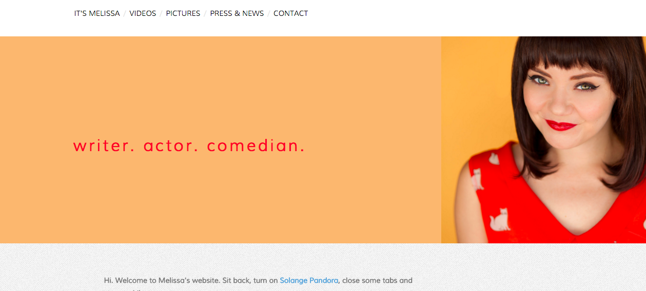
1. Fullscreen Navigation Design
This goes hand in hand with responsive web designs to ensure easy navigation whether you are using your smartphone, tablet or desktop. This design features a fullscreen background image that scales up to fit the entire screen of your device, leaving your site looking sleek and modish.
This is a website using FND:

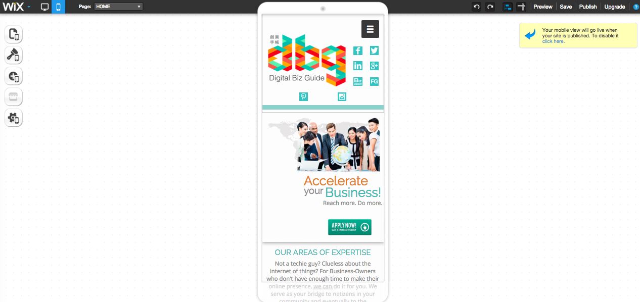
2. Responsive Front-ends
As mentioned in the first point, it is of utmost importance that you have a navigable website for a satisfactory user experience (UX). When Internet users discover your site’s slow loading speed, it can trigger a higher bounce-rate and turn them off from visiting your website again. Responsive front ends also means you have to squeeze your content concisely because the number of smartphone users is forecasted to reach 2.08 billion this year.
3. Flat Designs
This means you have to lessen the use of dimensional style like drop shadows, gradients and web textures. Focus more on sharper, bolder typography and simple but stunning illustrations. Avoid complicating your landing page especially your homepage. Simply put, this kind of design conjures app-like icons or images for optimal viewing.
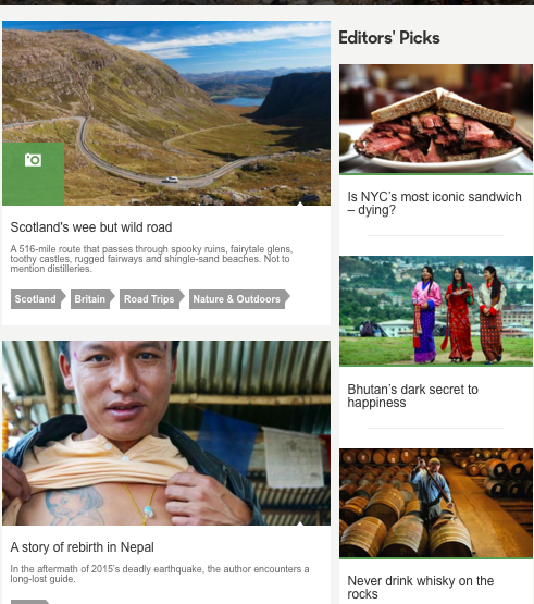
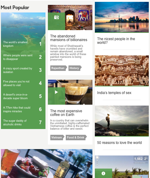
4. Card Layouts
This is hands down my favorite as of the moment. The idea of Instagram-like, square images that project a sneak preview of a particular content is appealing in both design and usage aspects. The constraints of smaller screen condense information into a brief summary with the image as the feature.
My favorite example is of bbc.co.uk
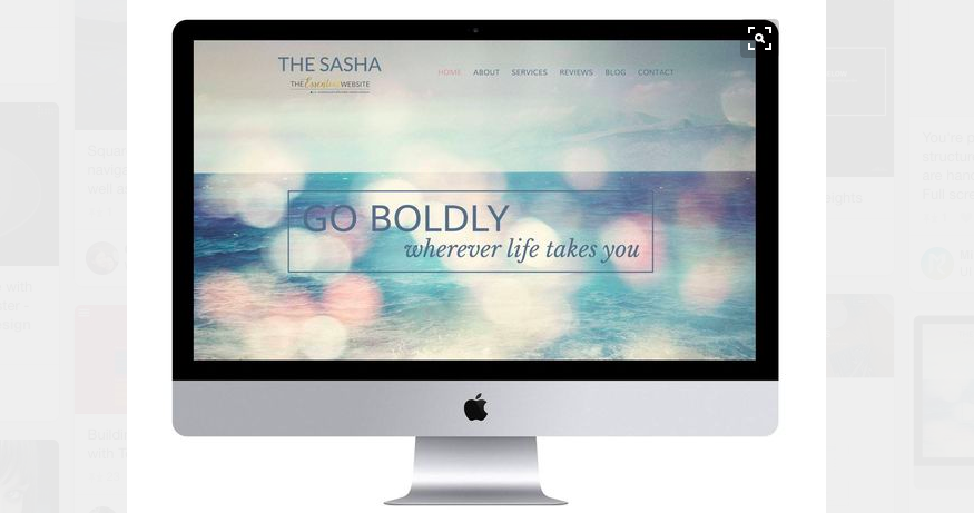
5. Hero Image/ Video
The Hero web design term could either mean an image or a video that serves as a large and attractive website header. It is usually positioned at the top or center part of the website that could go full width on the screen or just a mere portion. This is similar to no. 1 (full-screen navigation design). It’s becoming more popular and adapted more by westerners because it definitely showcases the American style of representation.
It will look something like this:
6. The Minimalist
All this lead me to believe simpler is definitely better. The lesser clutter display means more heightened focus in the message you are trying to convey to your viewers. Whether it’s a product, a service–your e-book, your content–minimalism emphasizes only on what you need and not on everything you want. Core colors include the basic abstract of black and white together with basic images. Get rid of all the unnecessary visuals, which more often than not can be an overload.
Whether you go web-responsive or full navigation design, do not forget to offer rich and quality content for search engine optimization. Most importantly, whatever design you choose, consider the loading speed of your site as the top priority. Too many elements on your site may contradict with what you aim to deliver and curtail traffic to your site.
At Founder’s Guide, there a lot of changes happening to address these issues. We can’t wait to adapt more trending but classic designs over the coming days!