In this day and age, a strong online presence is a must for every growing business. Online marketing has already become indispensable and for both small and big businesses as they try to capture more and more leads with methods like email marketing, digital ads, etc. However, this begs the question- are business cards still relevant? The answer is “yes”!
Reading the thoughts of experts on the role of business cards today, it’s not hard to see that business cards are still used in many occasions even though the world is increasingly becoming digital. This raises another question- how do you create quality business cards yourself? The following are some of the top tips to help you out:
1. Understanding the Basics
There are a few rules that apply to all kinds of business cards. These are:
- Choosing a font size and style that’s easily legible
- Keeping the DPI of the images at least 300 for the best quality
- Sticking to CMYK format for the colors
2. Avoiding Common Mistakes
To err is human, and designing business cards itself is by no means an easy feat. So, you shouldn’t expect perfection in your first attempt. However, by doing your homework and learning the right techniques and common pitfalls you can prevent a lot of rework.
Here is the thing- you need a professionally designed business card just like your business needs a professionally designed website. To achieve that, you must avoid the following:
- Typos or grammatical mistakes which reflect unprofessionalism
- Omitting important contact information from your business card. Ideally, it should have the following: business name, personal name, job title, website, email address, phone number, and social media handles
- Unreadable print
- Too many visual elements make the design look cluttered and disorganized
- Poor choice of paper. Many amateur designers pick high-gloss paper which can be tough to write on. Instead, what you should get is a high-quality matte card that’s perfect for writing and doesn’t bend easily either
3. Using a Grid
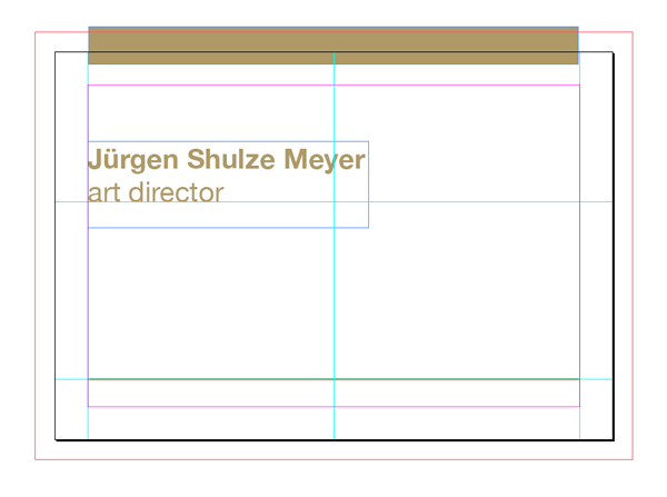
If you want a neat and well-structured business card design, then consider using a grid for both the front and reverse sides of the card. Not only this will make your job a lot easier, but it will also prevent your card from looking disorderly. Besides, most of the professional graphic design software including InDesign and Adobe Photoshop have inbuilt support for grids in the templates. For instance, for the latter you can find it in View > Show > Grid.
4. Using a Premium and Unique Logo
Your business card will be incomplete if it doesn’t have a unique and attractive company logo. This is because it’s one of the elements that simply pops on the card which is usually covered with dull text. Your company logo also helps to build a powerful brand and shows that you are dedicated to your business. That said, if you don’t have a logo already, then you can easily design one online in just a few minutes. There are a variety of advanced logo makers on the web that allow you to create unique logos even if you don’t have any experience in graphic design or art.
5. Experimenting with Different Shapes and Styles
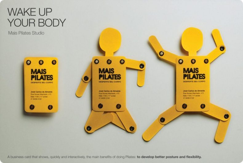
For most people, the term “business card” conjures up an image of a rectangular card that has a generic design-work and text. However, you don’t have to stick with this traditional format. There are all kinds of ways you can make your business card unique and impress a person with your creativity. For instance, if you supply pet food, then you can use a bone-shaped business card. Similarly, if you are in the office supplies business, then you can design a card with a foldable ruler. In this way, your card will look unique and serve a purpose too!
6. Picking the Right Paper Thickness
The thickness of your business card can make a huge difference in the overall quality of the card which reflects on your company. This is because only those companies that take their business seriously would invest in a high-quality paper which is thicker than 300gsm. Any thinner than that, the cardboard feels too thin and “cheap”.
7. Using QR Codes
QR codes might be an old technology but still holds tremendous value when used in creative ways. Just like these cryptic square codes are experimented with to help the poor in a cashless society, they can be used to give your business cards an “oomph” as well.
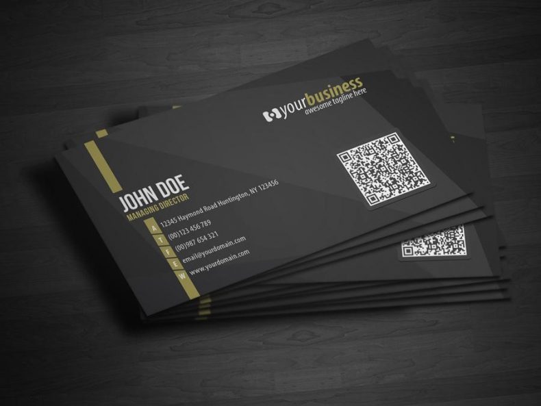
By printing a QR code on your business cards, you can save the receiver from the hassle of manually entering the name of your website/blog in a web browser. They can simply scan the code with their phone and reach your website in a few seconds. It also makes your business card look neat and clean. Besides, there are a variety of QR code generators on the web that can be used easily.
8. Keeping it Simple
A lot of people fail to understand how simplicity can be incredibly powerful. In any kind of graphic design work whether it’s a company logo or business card, using a variety of styles and techniques on a single product can defeat the purpose. What you need is a focused and neat design that makes the message crystal clear and shares the information effortlessly. So, when you create your first business card, always remember that “less is more”.
Business cards are a great way to share valuable business information with a personal touch. However, a poor choice of design can ruin your efforts. That’s why it’s strongly recommended that you take your time and get it right the first time. Good luck!


