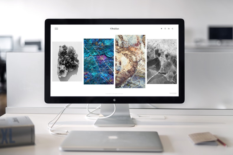
Your business needs a professional website but staying up to date with design on the web is hard, as trends and styles come and go so quickly that it can be tricky to keep track. Deciding on what colours, styles, and other features to use, it can be a minefield that ends in poor quality, misguided jumble of pages. However, there are a few simple hints and tricks that can help you deliver the most perfect modern web design without having to spend months hunched over your computer or a huge hole in your bank account. If you want to achieve a contemporary and sleek look, read on and implement the information you learn onto your creation.

Choosing A Font
Making the right choice of font for your website is very important. Picking something childish like Comic Sans will deduct any kind of sophistication from your site, and ultimately make the user doubt the authenticity of you and your information and services. Opt for something that’s more mature in its style, such as a typewriter font to add an air of intelligence or something more traditional like Times New Roman.
Picking A Colour Palette
When it comes to picking the different colours and shades for your website, you have to take its actual purpose into consideration. Going for autumnal shades like red, orange and brown will give your site a warmer and more personal feeling, whereas colder colours like green and blue will make for a more bright and open atmosphere. Whatever you choose, stick with it throughout every page and don’t jump from one contrasting colour to the next. Keep it neat and organised, and don’t allow yourself to go too wild with neons and the like.
Utilize White Space
To make a modern website, you have to utilize white space. It can be used in many different ways, including catching the users attention to make them focus on whatever else is on the page. By keeping a large section of the background on white in colour, you will be making it easier for visitors to clearly read information and not get distracted by anything that might’ve been happening elsewhere.
Making The Most Of Images
Including images on your site can really improve the look and overall design if they are used efficiently. Most modern designed websites use images sparingly, but when they are included they become the focal point of the page. Each image that you use should have a purpose, providing a benefit and relating to your website or information.
When you think you’ve mastered your modern web design, check for the top SEO agency to help your site reach as many users as possible. Show off your new look and style to the rest of the internet, and generate traffic to keep your website up there with the most popular in your field or industry. Maximise white space and allow images to have their own function in order to create the most beautifully sleek page as you can. If you need website services, you may want to check San Francisco website design.