A powerful business presentation goes beyond just slides because it’s all about positively impacting your audience.
In a quest to share information to build a large base of customers, most business presentations end up with a wall of text in bullet point format. When your slides read like a transcript of your presentation, it’s better to cancel your face-to-face interaction and send a copy of your transcript cum presentation to your audience.

As a picture speaks a thousand words, it makes sense to use visuals to create business presentations that deliver the intended result.
Overuse of text makes your words a lethal weapon–a weapon that can stifle away everyone’s attention to your competitors. Such presentations not only reduce sales but also result in a bad company reputation.
So, if you’re struggling with your presentations and worry that your wordy slides will make your audience regret their decision to attend your presentation, you are at the right spot.
In this article, we discuss some ways to ace your business presentation in 2021 and beyond.
11 Tips for Creating the Best Business Presentations in 2021
Here are a few tips for creating killer business presentations and witnessing your brand reach the sky.
1. Use presentation templates
Rather than spending hours creating a presentation from scratch, focus on using presentation templates. Pre-built templates can take your presentations miles because it makes branding so much easier for your business.
Kick-starting your presentation with a business-friendly slide design can result in a positive first impression. With presentation templates in your kitty, you only worry about writing content that resonates with your target audience.

Whether you’re a first-time presenter or someone with vast experience giving presentations, focus on using templates from Pitch.
From investor updates, pitch deck and SaaS investors templates to sales proposals, product launches, and conference presentation templates, Pitch is a storehouse of presentation templates for different business scenarios.
Using professional templates upholds your company’s image among competitors.
2. Build your slides at the last
While it may be intriguing, monkeying around with your slides is of no use. Why?
What’s the use of building a road when you don’t know where it’s heading to? So, why play with the design and structure unless you know what to share with your audience.
When creating a presentation, write down the points you wish to share with your audience and create a logical content structure. After your content is ready, focus on building or designing your slides.
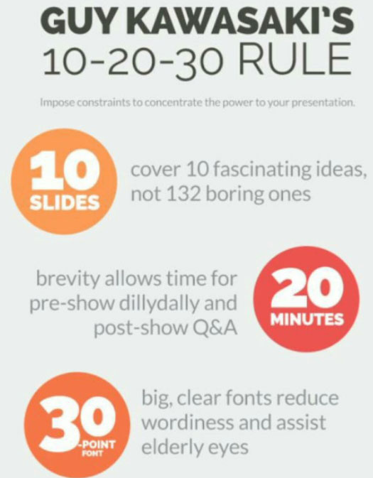
3. Follow the 10/20/30 rule
Who doesn’t like breaking the rules? As we build rules to break them, breaking the famous 10/20/30 presentation rule can cost you your audience’s attention.
According to Guy Kawasaki (the brain behind the 10/20/30 rule), an ideal business presentation has ten slides, 20 minutes, and no font smaller than 30 sizes.
Why is this rule necessary?
Ten slides give presenters sufficient time to summarize their arguments. Any more information and your audience are likely to lose focus.
20 minutes is the time an average person pays without losing his mind.
A 30-point font size is a large font that ensures everyone can read a presentation, even from the back of a large room.

So, keep your presentations brief and to the point.
With the attention level of listeners dropping after 15-minutes, extending a presentation beyond 20 minutes means you’re inviting customers to doze off and remain inattentive in your presentation.
4. Keep words off your slides
Time and again, you’ve heard of using less text on your slides. Why?
A cluster of text on your slides makes it look like a script and defeats the entire purpose of your presentation. So, when creating your next business presentation, remember to have only seven to eight words per slide or less.
Presentations with rich visual content are always a success because instead of reading what’s written on the slide, your audience gets to hear you presenting your ideas.
The lesser your words, the more are the chances of connecting with your audience and capturing their attention.
5. Strengthen your presentation with quotes, images, or stories
Visualization is the key to success in creating the best business presentation. The audience responds much better to presentations consisting of quotations from famous people and images to convey a message.

You can even use an attention-grabbing video or touching story to prove your point. What Steve
Jobs aced in his presentations was his ability to connect with the audience using a story. You can share stories by highlighting a problem and how your product or service will lead your audience closer to a potential solution.
When using stories to strengthen your presentation, keep it short and add visuals related to them to make an impact.
6. Have one point per slide
For delivering presentations that increase signup or product sales, remember to have one point per slide. Covering too much ground on a single slide hammers your main point and confuses the audience.
Concentrate on creating slides that contain only one idea. If you’re under the impression that you can save time by cramming content in a single slide, you’re wrong. Though your number of slides may increase, your communication effectiveness will likely increase. Why?
Your audience concentrates on a single idea rather than juggling and getting confused between three different ideas.
7. Convert bullets to graphical elements
Having too many bullet points on a single slide will only add to your presentation misery. How?
Your audience would probably be busy reading your slides while you’re talking. They won’t concentrate on what you’re saying. So, as a first step, reduce the number of bullets you use in your presentation and if it’s an absolute must, convert your bullets into graphical elements.
Also, to prevent your audience from reading the points before you present them, add animation to each point to appear after you complete reading it.
This helps your audience concentrate on a single point, and they don’t deviate from what you’re trying to say.
8. Use pictures in your background
Let’s face the ugly truth, a plain white background makes your presentation look plain, and it fails to deliver the intended visual appeal.
So, consider using an image as a slide background. However, when using a picture, ensure enough contrast between your background and the color of text or images you plan to use in your presentation.
Ensure your text is readable and still stands out. While you can use any image from Google or other sources, focus on using one that aligns with your branding and adds some meaning to the ideas you’re presenting.
9. Utilize data wisely
When used wisely, data is a good thing for your business, depending upon how wisely you will use it.
So, focus on using excel charts and graphs as they’re impossible to make sense on a screen. If you want to present numbers to your audience, focus on using an infographic style rather than using a typical excel chart.
When using statistics in your presentation, always source your data and find the most relevant information. Using five- or ten-year-old statistics without a source is likely to detract your audience as they prefer credible sources during a presentation.
10. Brand your presentation
Every business presentation is an opportunity to strengthen your brand and ensure your target audience remembers your brand. Branding a presentation is all about ensuring consistency.
Putting things like your logo, using your brand’s color, and ensuring color consistency in your presentation is great to build a company’s image.
Focus on making your branding subtle, and don’t overcrowd your slides with designs and images of a brand. If you’re a startup and you’re not using a logo yet, introducing it first in your business presentation may not be a good idea.
11. Ask thought-provoking questions
When creating a presentation, make your audience a part of it. Instead of presenting just information and data, ask questions that awaken your audience. Asking thought-provoking and intelligent questions can help your listeners grasp the content you’re delivering.
Consider your business presentation similar to a marketing strategy. When you create a strategy, you consider your target audience.
So, when creating your slide, think about how your audience will benefit from it and what questions your presentation answers.
Creating a presentation that delivers
While creating presentations is no rocket science, you only need to adhere to these eleven tips.
These tips can empower you in small ways, resulting in favorable outcomes.
Make sure to dedicate time to make your presentation flawless. So, rather than focusing on a text-rich presentation, focus on using visual content to win your audience’s attention.
All business presentations serve a definite purpose, so create a presentation that serves it.
While there may be other ways to create a presentation, we’ve managed to scratch the surface with these eleven tips.
How are you creating your best business presentation?
Please share your thoughts with us!