“A palette of design and a dash full of color. Mixed with good intentions and shake it with a je nais se quoi factor.” This is my formula to make a logo that will surely fire your business up.

But don’t take my word for it. Constructing your company logo isn’t rocket science but it’s not baking cookies as well. We know it too well, branding takes chary execution. Think of it this way, your logo is an investment! And because it’s not just another design or photo pasted on whatever – it is your IDENTITY. And you must own it!
Your logo should reflect your identity/branding/style
Never take this for granted. The logo sums up all your advertisement and promotion. If you look closely, “design is not much of how it looks but how it works”. But before we get to the working part, the graphical vision must be taken cared of first. Based on studies, color is the most important factor to be highlighted. Backed up with psychological and scientific explanations, it has a sincere effect on the consumers and viewers. For example, if you see a red can, you’ll directly assume Coca-Cola. Or if you look at the primary colors, the first thing that you associate with it is Google. That’s right! Color has that effect on people. Moreover, your selection of color will or will not depict the trustworthiness of your product, your service or your company. It moves the customer’s opinion more than what you might expect and this happens subconsciously.
What to consider when choosing a color
- Match it with your advocacy
- Nothing too flashy that hurts the eyes
- Non-evasive color palette

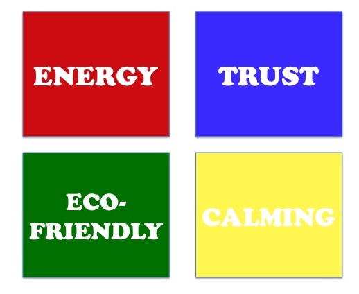
What color means what:
Non- evasive choices can induce approachability [user-friendliness] and calmness [confidence]. It’s good to have that catchy, striking feeling but again, does it reflect standards? Just by looking at your logo, with just a blink of an eye and a split of a second it must invoke a lasting feeling. The simpler the better [fast absorption]. Less is more. (always, always, always).
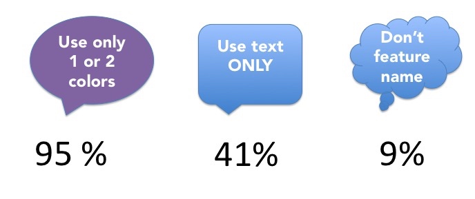
According to research:

- Ask yourself these questions before sketching the design:
-
- What am I trying to convey?
- What do I want people to think?
- Who is my target audience?
- Where am I going to put it?
Complex texture and object may breed sophistication but not encouraged because people tend to shy away from things that are too difficult to read or understand. Additionally, the concept should be universal in that wherever you place them the visibility is not compromised. Positions such as web screen, primary photo, store shelf, direct on products, letterheads, billboards or clothing.
Never opt for plagiarism or imitation. Even if you covet the attention and you trick people into thinking you’re humorous- it is not the kind of style you want to prefer. Otherwise you will be known without originality. It’s hard to recover from that. YOUR LOGO IS YOUR PERSONALITY. Retain values that are clearly spoken by the way your brand is graphically delivered.