It’s no secret that first impressions count. Whether you are heading out on a date or speaking in public at some event, you probably already understand the critical of presenting yourself a certain way. The same thing goes for your business. There is no point in creating an excellent product or service if you are not going to provide a perfectly crafted image to go with it. Sure, YOU might know just how fantastic your business is – but how are your potential customers going to know it? You need to present a particular image to them that shows them what you are all about, and why you are so much better than your competition. Sound relatively straightforward? Don’t be so quick to judge.
Most brand images have been carefully curated by a specialized team of business, marketing, and PR professionals – not everything is as organic as it first may appear. Take, for example, iconic brands images, such as Coca-Cola. Chances are you would spot one of their cans a mile off, and you already have a pretty clear image of their brand in your mind’s eye just from someone mentioning the name. All of this is no accident or coincidence. If you want your brand to reach a similar sky-high level, you will need to sit down with your colleagues to develop your brand image from every corner. Here are the top areas you need to be addressing.

Logo
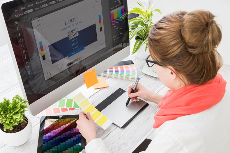
Every company has a logo – an instantly recognizable badge that becomes its trademark. Or, sometimes, not so much! There are many mistakes to be made when designing a company logo, and all too often, brands get it wrong. Common mishaps include making the text too small, making the image too convoluted and the logo being irrelevant to the business. The best way to come up with the direction of your logo is to sit down and focus on your core value – what do you represent, and how can you present that to your audience via a logo? You also need to bear in mind the practicalities of your logo. For example, you could produce a design that looks incredible blown up on the side of a truck for marketing purposes. But have that very same logo printed onto your company business cards, and the whole effect is lost; the design is too intricate and small. Continuity is essential, so you can’t get around this simply by changing your design to fit a certain size or shape. Even subtle differences in the logo will confuse your audience, and you will find that your brand as whole struggles to flow as well. If you’re unsure where to begin, why not consider trying out an online logo builder? Here you can try your hand at designing your logo yourself, without having to fork out thousands of dollars for a pricey designer.
Online and print materials
Continuity was mentioned above, and this is something that is critical in all aspects of your marketing materials. There are now so many different ways to promote your brand; it can often feel quite exhausting just trying to get your head around them all! A company website, social media channels, print adverts, flyers, leaflets… keeping track of it all can be quite the challenge. Plus, ensuring that each one fits the brand image and that they seamlessly flow with each other is ever harder! For example, the last thing you want is to commission a huge run of promotional leaflets, for, say, a trade event you are attending. Only to find that when they arrive, they look completely different to the banner you bought for your stall at said show. The font is different, the color scheme doesn’t flow, and you can’t properly make out your logo. This can be disastrous as it looks sloppy, and as though you don’t fully understand your brand. If you’re confused about your own brand, how can you expect other people to put their faith in it as a service? Set some ground rules for continuity in any promotional material and POS your company produces. Pick a suitable font and stick to it (and always double check this font works well in ANY size). Decide on a color scheme to make your trademark – and although you can vary it a little from time to time, try and be consistent in this area. There are also other things to look into as well, such as whether you use cartoon photos, stock photos or more ‘arty’ photos for use in your promotional materials.

Staff
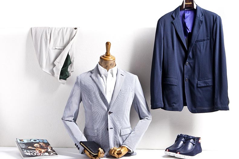
It isn’t just the official business side of your photos you need to think about when it comes to image. Image within a business can also be traced down to a personal level, in the form of yourself and your employees. Whether you like it or not, everyone that works for your company (yep, that means you too!) is a representative of it at all times, so there is a certain image to uphold. Most workplaces have a dress code, so don’t be afraid of enforcing one. If your business is fairly formal, business attire may be the best route to go down, or potentially smart-casual. However, if your company has gone more down the creative side, encouraging employees to dress in a more expressive way could actually benefit the business. Whatever route you go down, however, always make sure that you and your staff are well presented with clean clothes, fresh hair, and a confident demeanor. Staff image can also relate to public social media profiles, so encourage your employees to keep these profiles private, especially if it is known that they work for your company. There is nothing wrong with having a personal life as well as a work life, but it is usually in everyone’s best interests to keep the two separate.
With these measures in place, you can ensure that your business’s image is protected and it can therefore continue to thrive.