
Why optimize your site for mobile devices
Over the last few years, we’ve seen a steady increase in mobile phone usage. In 2021, mobile users comprise more than half of the global audience. Having a 5G connection and Internet of Things around the corner, the trend for mobile web will preserve. This means more and more people will get into the habit of searching the web from their smartphones.
The rise of mobile search and Google updates
The growing number of mobile users became a too important factor to ignore. The fast speed of web search, volatility, and peculiar search intent led Google to make a distinction between desktop and mobile search.
In the past, the company implemented a series of algorithm updates with a focus on mobile searchers. The first important update popularly known as Mobilegeddon took place in 2015. The update ranked up pages that were optimized for mobile devices in mobile search and dragged down not mobile-friendly pages. Desktop searches were not affected by the update then. With Speed Update in 2018, page speed became a ranking factor for mobile pages.
Starting from July 2019, Google enabled default mobile-first indexing for all new websites. In 2021, it switched to mobile-first indexing for all sites. This means that sites are now crawled with the Google Mobile bot first.
In June 2021, Google totally implements the Web Core Vitals algorithm. The update is expected to enhance lightweight and speedy pages. To put matters simple, you’ve got to make your sites fast-loading and user-friendly to help them perform better.
How smartphones change user habits
Mobile users interact with their devices differently from the way desktop users do:
- Mobile users have a fewer attention span.
People surf the mobile web on the go, to solve immediate questions, at parties, while shopping. This builds a variety of specific habits: asking tips and hints; looking for answers right in the SERP; the widespread use of voice search and online assistants. Mobile users are more volatile, faster, and better focused on getting the right result.
- Mobile search is stronger often influenced by geolocation.
As people tend to use mobile on the go, they often look for places and addresses. This factor stressed the importance of local search optimization. The immense role is given to Google Maps and the Local Pack.
- Smaller screens affect user engagement.
As mobile users want to solve their quest on their phones, they need to have an easy method to perform certain actions quickly. For example, they need to call (okay, not call, chat to online assistant) or need to make a reservation via phone. This is where UX and UI rule: usability may not suffer.
Yet in early 2017, one of Google’s updates made an impact on sites with intrusive interstitials. This applies to present-day sites as well: no popups, large sign-up forms, or notifications should interfere with user experience from the moment they start loading your page. A bounce happens when users close the page without interacting with it. According to Google, if page load time rises from 1 second to 3 seconds, the bounce rate increases by 32%. A high bounce rate can be a signal to the search engine that the page is irrelevant or poorly performing.
- People on smartphones started to ask queries differently.
Because of the spread of voice search and because the search is more about fast emergencies, queries on the phones get longer and turn into full sentences. And this becomes an interesting trend for SEOs to explore. Which we will touch upon a few lines further.
Taking into account all of the above, how is mobile search different from stationary search? And what do you need to do when you optimize your site for mobile devices?
Optimizing for mobiles
Step 1. Check your mobile search rankings.
The starting point is to find out your site’s online visibility in mobile search. You can use Rank Tracker software with its mobile rank checker. (First, you’ll need to install the software, but it won’t take long.) Start the tool, enter the URL of your site, add your target keywords. In Advanced project settings, pick the mobile user agent to crawl your pages the way Google mobile bot sees them.
When you add your target keywords to the Rank Tracking module, you will check the ranks for the top results for your site (and your competitors as well, if you want). With every next check-up, you will get information on whether your keyword lost or gained some points. You will be able to compare the SERP features present for the keyword. You will be notified once some page of yours enters or leaves the top 10 on the search results page.
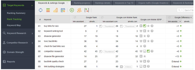
Tracking desktop and mobile rankings separately, you will be able to learn more about your audience’s behavior and tweak click-through trends. You can analyze a benefit of this or that rich feature, which position is more profitable for this or that keyword, etc. With the tracking options, you will get many insights about your audience and what people want about your product.
Step 2. Do a mobile-friendly test of your pages.
There’s a free tool from Google to test your site’s mobile-friendliness. The tool is available right from the Google search bar if you enter “mobile-friendly test”. All you need to do is to type in the URL of your page to analyze.
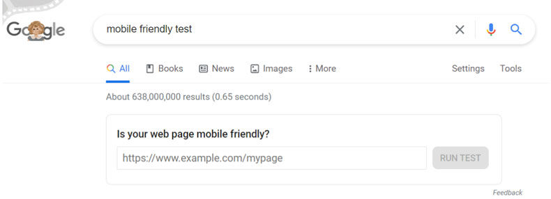
The tool will deliver a statement of whether your page is mobile-friendly overall. Additionally, it will show the page loading issues and clues where they make an impact.
Another tool to check a bunch of factors related to mobile friendliness and page experience is in the Core Web Vitals report. It overlooks the loading, interactivity, and visual stability at the page level. To have a general understanding of how your site performs at a larger scale, go to your Google Search Console. First, you will need to link properties and set up field data to be powered from the ChrUX report. The report shows the total number of URLs that pass the Core Web Vitals criteria, pass with some issues, or totally do not pass the test.
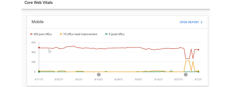
Look through the URLs and fix the faulty components that make the page experience suffer. Remove unnecessary scripts, compress files, and do all other technical SEO optimization to get more pages to earn the best result. And if you have separate mobile and desktop versions of your site, make sure that all information on them is correct and consistent.
Step 3. Optimize your pages for mobile search.
Improving only technical SEO is half work done. The other half is optimizing your content so that your pages become more relevant to mobile queries.
- Optimize your pages for local queries.
First and foremost, track local competition and find queries that your target users would use. For tracking ranks, specify your target location and search engine. If you run a business entity with a physical location, set up the Google My Business page and optimize for Google Maps. Reviews, comments, and ratings on reviewing platforms are a great tool of promotion in this case.
Note. The point here is to track your keywords geo-specifically, which means that you need to define your custom search engine in the rank tracker preferences. This can be Google US, or Google Columbia, or even Google Boston, US. Keyword positions are most likely to vary for different search engines as well, so you may want to run ranking checks across alternative search engines. For example, Yahoo is the 3rd largest search engine in the US. So set the settings in the tool to add geolocation and add Yahoo to your search engine list.
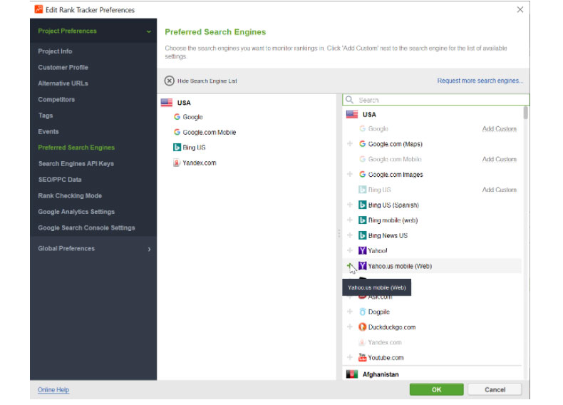
Now you will get a separate column for the Yahoo rank checker. You will be able to compare how your mobile ranks differ on Google and Yahoo.
- Research keywords coming from voice search.
Queries from mobile users often come from voice assistants. Which means they are often full sentences and questions. Look through keyword research methods in Rank Tracker such as People Also Ask, Ask Me, Related Questions etc. Optimize your pages with FAQ sections answering questions of your target visitors. Take notice of what kind of SERP features are present for your target queries. Consider whether it would be beneficial for you to get such a SERP feature or to stay in the organic listing below.
- Add structured data
Structured data is a way of telling Google what your pages are about. Structured data are necessary to enable some types of rich features, for example, showing a carousel to swipe through on mobile devices. The feature is useful to have for some types of content, for example, recipes, movies, restaurants, or learning courses. There are free tools to add structured data markup, such as schema.org, and a free testing tool to test rich results appearance as Googlebot smartphone gets it.
These are our major tips on how to set up your mobile SEO. Have you got any examples when mobile SEO needs special tackling? Please share your experience and hacks in the comments to our post!