
Sorry I mean no harm when I say C.R.A.P. In this context you will understand why that acronym means a lot for designers. They say you’ve got to play by the rules, and once you know the rules, you’ve got to play by the heart. For beginners and amateurs, not only is this principle taught at school – it should also be put into practice all the time. This can also be used and applied by sales personnel in drafting their presentations as well. Familiarizing this concept will enrich your visual presentations and is appropriate for almost everything.
Whether it’s putting up your online store, your personal blog or publishing your company website, design could be a little tough to battle. It takes focus and enough concentration to deliver the end result that appeal to the audience. If you want to achieve this, follow the four basic design principles.
4 Basic Design Principles
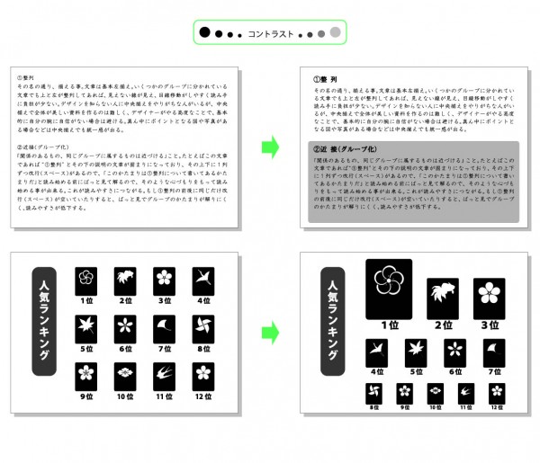
CONTRAST
Highlighting parts that are important and weaken others is very important when you want to make an emphasis. This is to strike the difference on a visual point of view. You can do contrasting by making the title bigger and the paragraph smaller. You have to decide on the pattern because it won’t work if you’re in doubt. Making contrast is not just about the size of characters but also about the color, spacing, and font style. For beginners, a maximum of two fonts will be better for a single document.
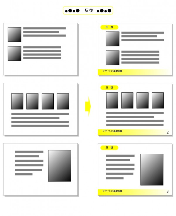
REPETITION
This means to repeat the same design using one concept. For example, in magazines, the page number is always put on the same place. The structure of titles is on the same position as well so that the reader can tell without any explanation that that is indeed the header/title. The power of format can change the way people look at things.
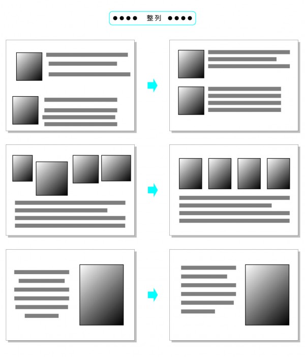
ALIGNMENT
Alignment refers literally to the organized, justified edges of your content when writing. Basically, if things are aligned they give the illusion of an invisible line drawn in the spaces of your sentences. Your content is more recognizable this way. Beginners should avoid the “centered” design. It would be better to align it on one side as a basic rule so people can move their eyes to and fro pleasantly.
PROXIMITY
In other words, it is grouping the things which are related to one another. Relative association will make your design more understandable for the viewers. To optimize your design, you need to associate things that are similar in concept. Dividing them by concept is one example for this. When using multiple pictures, divide the description for each one to produce a clearer definition.

So when you think about design, take into consideration who your readers are and when they’re going to view your content. Putting the “CATCHPHRASE” will ultimately make the biggest difference. Always think about time, place, and opportunity.
Time. Place. Opportunity
Design should always match with these three factors- time, place and opportunity. Of course, frequent studying and constant training will get you a “good eye” on things. Develop your design skills by following these basic rules and you will never go wrong.